This is the front cover for the digipak. For the main image I felt that it would be good to use an image which has a nice background as well as being bright. I also chose this particular main image as it looks as if King J is celebrating and happy, although you can not see his face.
Tuesday 28 February 2017
Monday 27 February 2017
CD 2
This is the second CD within the digipak. This CD consists of the extras, once again I have just gone for an image which has been slightly edited as well as the text saying "extras", this looking a lot like the first CD.
Sunday 26 February 2017
CD 1
This is the first CD in the digipak which will hold all of the songs. The cd itself is a simple enhanced image with a black background. The text is the same font but two different sizes as I feel it looks better this way.
Saturday 25 February 2017
Digipack Planning 12
I have decided to go with a simplistic spine that has two sections, one with a simple design and the second with the continued design but also the album name. The colour scheme through out will be black and white as its simplistic but also stylish and pops enough where it would be eye catching at a store. I feel that at this point I have completed the digipak as the two panels which I previously had information will now be high quality and slight edited images so that the digipak flows better.
Thursday 23 February 2017
Wednesday 22 February 2017
Opinions on Final Edit
I think overall the edit came out pretty good considering during filming we didn't have the best of hopes. The scenario was very similar to our first project involving Agent X were we felt our first draft was really bad especially comparing it to others but as we re filmed we added new ideas and almost completely changed it which overall made it better. The new shots we added to the music video suit the conventions and goes really well, although there are some shots I would have liked to re film such as the studio shots I feel it overall came out well.
Tuesday 21 February 2017
Monday 20 February 2017
Digipak Planning 11
I have decided to include second font as well as change the design. Due to the lack of time I have decided to go for a simplistic design compared to my previous version so that I can concentrate on including all the necessary components of a digipak.
Sunday 19 February 2017
Digipak Planning 10
I have decided to almost start from scratch with my digipak due to the rushed nature of my first version of the digipak. To get more of an idea of the elements im missing i am looking at others for inspiration to see what they have that my prior version didnt have.
Digipak feedback
The feedback was mostly negative due to the fact that the work was rushed and I often run into technical issues. The positives of the digipak were the photography which was a shared positive with the group thanks to Ghanshyam. Another positive was the font although most agreed, such as myself that I was over using it and I needed another font within my digipak. One negative of the digipak is the fact that the discs I used as my example are not perfect circles and look poorly cut out. On the extra CD they felt the image used Is poor as it looks like a mistake and the photographer has took a photo while Jacob is messing about. On the social network pop up the word 'social networks' should be taken out. Another thing brought up was that conventionally tour dates isn't put into a digipak so I may change it and instead fill it with just an image of the artist.
Filming 5
This is is the final filming session were we went around the welling area. We filmed outside of a large building with a metal gate, we did not have a set location although the location we did film at looked good on camera.
Filming 4
For this filming session we went to Greenwich. We filmed at night so that we could have a contrast in shots, from day to night as its fitting with the song. The locations we used were both pitch black as well as well lit areas. Although both types of lighting looked good on camera the ones shot in less lit areas ending up being too dark and didn't look as good.
Filming 3
In the end we went to the top of the hill to film more shots. The shots involved mostly the camera going around our artists. We chose the location as the background looks nice while the artist is in the centre of the image. The shots went well were we got a variety from different angles and different movement patterns which adds variety. The reason behind the shots is so that we can have more shots that cut into our original video as some shots drag on and get boring, the booth shots.
Music Video First Draft Analysis
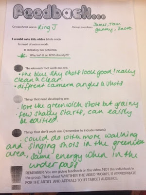
We have now completed the first draft of the music video and uploaded it to Youtube. After viewing it multiple times we noticed a few issues. One issue includes the fact that in certain shots we filmed during school resulting in us not being dressed in the proper attire. Another factor being the syncing which is off in certain areas, although this can easily be fixed by editing. The structure and flow is good for a first draft and we feel although its sub par, its a good starting point.
Subscribe to:
Posts (Atom)


